What does an accessible document look like?
Accessible learning materials are vital to our students' and our institutions' success. Making a document accessible is more than just making it suitable for someone with a disability; it's a method of teaching that is advantageous to everyone. You'll see how the procedure can fit into your workflow after you have a better understanding of it. You could be surprised by how many common features already exist in your materials.
Related tutorials and resources: Accessibility Checklist, How to make a PDF Accessible, Accessibility for Distance Education Resources
An example of a properly formatted document
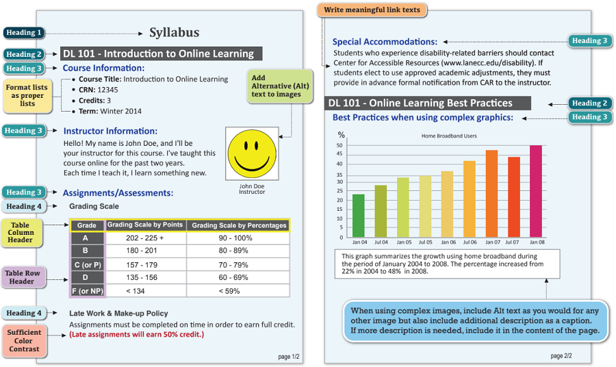
Fig. 1 - This image highlights the essential components of an accessible document. It features well-structured headings for easy navigation, informative tables for data representation, alternative text descriptions for images to accommodate visually impaired readers, and thoughtful consideration of color contrast for improved readability. An explanation for each area represented is located in the section below titled "Let's break it down".
You can download an example document here.
Let's break it down
Here are a few helpful guidelines that you should adhere to when creating a document. Following these guidelines will help ensure that your content is accessible, No matter whether your document is a Moodle page or PDF, the fundamental steps required for accessibility remain the same.
Employ headings in popular text editors such as Word, Google Docs, and Moodle to structure your document logically. By incorporating headings, users can easily scan the page for content areas, and screen reader users can benefit from the creation of a table of contents, enhancing navigation and accessibility.
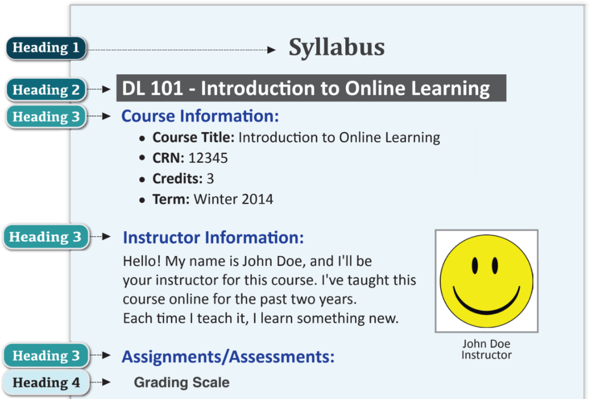
Begin the following sections with a title or sentence that introduces the reader to the approaching topic. Using a unique headings system helps separate and classify sections. Heading 1 - 4 are the type sizes to help you show the relationship between ideas in your document. Heading 1 is the largest and bolded. Heading 2 is slightly smaller or in some way distinguished from first heading 1. Heading 3 is further distinguished by a smaller size, italicizing, and/or indentation from heading 1 and heading 2. This pattern continues so on with heading 4.
Headings should also be properly nested. Your headings should follow a clear outline where each heading goes one step down each time. For example starting from heading 1 you would go down to heading 2, you could have another heading 2 or go down to heading 3, then you could go to heading 3 or a heading 4. Always take one step down at a time but you can jump up to any heading number when you want to at any time.
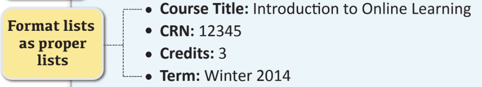
Screen readers depend on lists to establish connections between items when presenting content to individuals with visual impairments, making the proper use of lists crucial for an inclusive reading experience.
Use numbered lists or bullet points depending on the context by providing short central principles of details. A proper list implies emphasis and summarization of the information.
Numbered lists: Use when order is important, such as a recipe.
Bullet points: For a list of items
As you format the picture, add alt. text by describing the image as it relates to the topic. Providing alt. text improves accessibility by describing what an image is showing to your audience who do not have the ability to see them.
Note: When using complex images, include Alt text as you would for any other image but also include an additional description as a caption. (See Fig. 1 If more description is needed, include it in the content of the page.
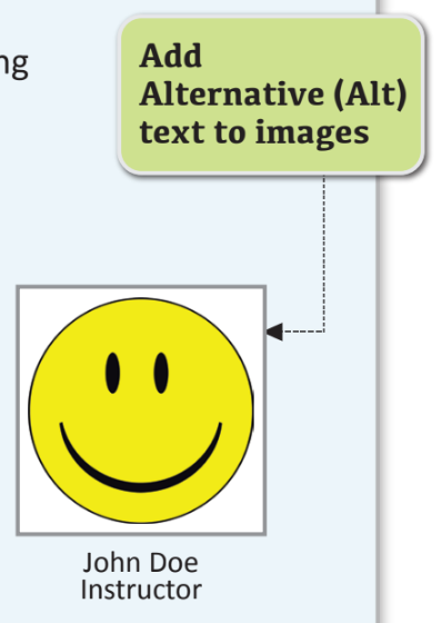
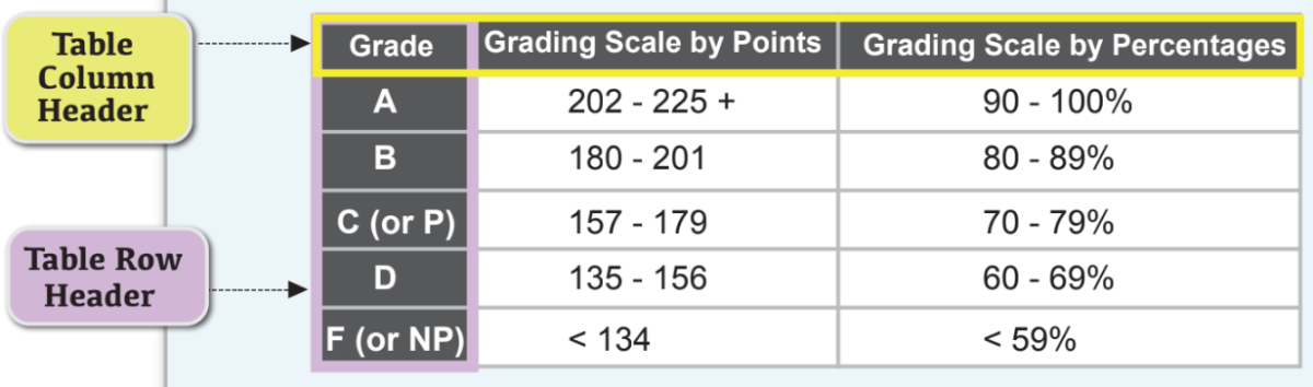
Table Column Header
Add in the top left corner of a table a title for the type of information your audience will find in each column. This way your audience will be able to navigate the table by understanding its objective.
Table Row Header
Add on the top row of a table a title for the type of information your audience will find in each column. Marking a table header row tells your users how to read the table.
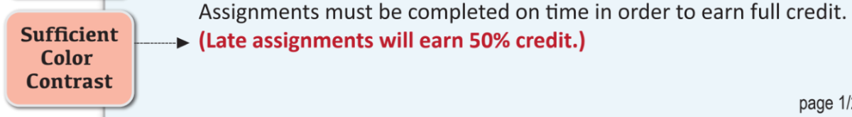
When choosing colors between background and text, select colors that stand out from each other (i.e. black and white, yellow and blue). Color contrast impacts the readability of your content, Especially for audiences who are low vision or audiences who are colorblind.
Use WebAIM's Color Contrast Checker to check for sufficient contrast.
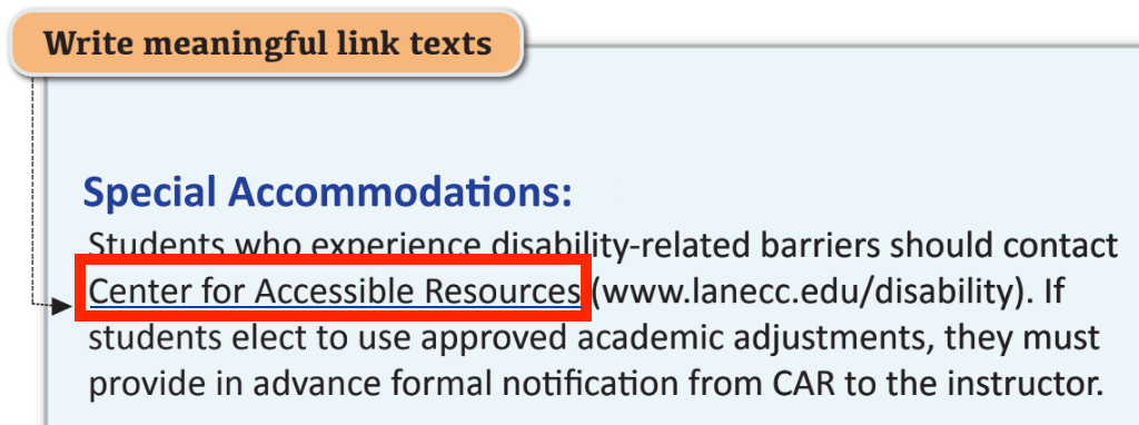
Create a short and purposeful description of what happens when your audience clicks on the link. Meaning link texts aid your audience's navigation, while still understanding the context.