For staff, vendors, agencies, and anyone creating materials that represent Lane.
Questions? Contact Marketing & Communications: marcomm@lanecc.edu
How to Use This Guide
This guide serves two audiences. Knowing which one you are will save you time.
| I'm making a quick flyer or digital sign | I'm a vendor, agency, or designer |
|---|---|
Please read: Brand Personality, Colors, Typography (Canva column), Logo Basics, and the Quick Reference card at the end. Start with a branded Canva template from Marketing & Communications. | Please read the full guide. Pay close attention to Logo Colors, Typography, Secondary Logos, and the Photography and Video sections. Obtain all logo files from or Marketing & Communications. Please do not copy from the web or documents. |
Scope
These standards apply to all Lane-branded materials — print, digital, social media, video, and in-person. Additional guidelines exist for:
- Digital Signage
- Social Media Standards
- Subsidiary Logos
- Titan Athletics
For campus wayfinding and sign systems, refer to the Sign Standards (contact Facilities). For merchandise and swag, contact Marketing & Communications at marcomm@lanecc.edu.
Brand Personality & Positioning
Lane is the community's college. We support every student — from a sixteen-year-old getting a headstart to a seventy-year-old learning a new hobby, from a transfer student headed to med school to a CTE student building workforce skills. We believe in our students and the importance of our work in making our community a better place for everyone.
When creating materials for Lane, keep these brand touchstones in mind:
| Authentic | Imperfection is OK. Build trust and let people know it's OK if they're imperfect too. We're also proud of our 60+ year history helping students achieve their dreams. |
|---|---|
| Accessible | We meet students where they are and value quality education for all learners. |
| Caring | We care about our students and our community and welcome them to our campus and programs. |
| Multifaceted | We serve a wide range of students — across age, gender, race, ethnicity, ability, area of study, and more — with a rich variety of programs. |
| Local | We're rooted in the Lane community and proud of our Pacific Northwest identity. We're not afraid to be a little quirky. |
| Driven | We're proud to help people reach their academic and career goals, and we're always looking for innovative ways to meet evolving workforce needs. |
Writing Style
Consult our full Writing Style Guide here.
Quick guidelines:
- Use AP Style
- Aim for concision and clarity; strive for an 8th-grade reading level
- Avoid acronyms and jargon
- Be friendly and informal, but still knowledgeable and authoritative
- You may use contractions and the occasional exclamation point
- Write in second person — address the reader directly
- Write with an active voice: "I made a mistake," not "Mistakes were made"
- It's "associate degree," never "associate's degree"
A Note on AI-Assisted Writing
AI-assisted writing should be used thoughtfully. Readers can often recognize AI writing. It doesn't tell our unique stories, it can make mistakes, and it doesn't convey the authenticity that is a core Lane value.
If you use AI as a starting point, edit it carefully and thoroughly before publishing. Human writing will convey the care and authenticity our audience deserves.
The Lane Logo
The Lane Community College logo is the trademark of the college. The icon symbolically represents learning (the open book) and illumination (knowledge gained through education). The sun rising from the book also evokes our home in the Willamette Valley.
The logo has been carefully crafted. Its proportions, spacing, and colors must not be altered in any way. Consistency is the foundation of a strong brand.
Obtaining Logo Files
For professional designs, please obtain logo files from the Marketing & Communications departments (marcomm@lanecc.edu). Do not copy the logo from existing documents, emails, or web pages — this produces low-resolution files that degrade quality.
For internal use, you can find PNGs of our logos at lanecc.edu/logos
Official Logo
The standard stacked logo is the primary version and should be used in the vast majority of applications.
Logo Versions
Use the version that best fits your space and background. When in doubt, use the full-color version on white.
| Full color on white | Default choice for nearly all print and digital applications. |
|---|---|
| Reversed (white + gold sun) | Use on dark backgrounds. The text is white, the sun remains gold. |
| All blue | Single-color option for light backgrounds when full color is unavailable. |
| All white | Use on dark backgrounds when the reversed version is not available. |
| All black | Only for black-and-white reproduction (print ads, photocopied handouts). |
Alternate Logo Versions
These versions exist for specific situations. Do not substitute them for the primary logo without a clear reason.
| Horizontal version | When the stacked logo doesn't fit the available space. Use only when the standard logo would be unreadable. |
|---|---|
| Icon only | May be used as a supplementary design element on a piece that already includes the full logo (e.g., catalog spine, website favicon, social media profile image). Do not use the icon alone without Marketing & Communications approval. |
| Secondary (program) logos | Each program and service has a standard secondary logo. Use the secondary logo in place of the official logo for program-specific materials. It should never appear side-by-side with the official logo. |
| Special/anniversary logos | Used only during the designated event period and only as directed by Marketing & Communications. |
Logo Encroachment (Clear Space)
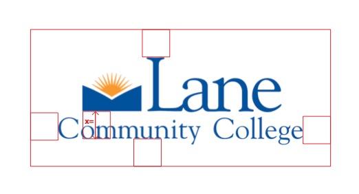
Always maintain clear space around the logo. The minimum clear space on all sides equals the height of the open book icon within the logo. No text, images, or design elements should enter this zone.
The minimum print size for the logo is 1 inch wide. Below this size, the wordmark becomes illegible. Exceptions for small promotional items (pens, etc.) require Marketing & Communications approval.
Logo Do's and Don'ts
| Do | Don’t |
|---|---|
| Use the official digital logo file obtained from Marketing & Communications. | Copy the logo from a website, PDF, or email. |
| Resize the logo proportionally using corner handles. | Stretch or squish the logo to fit a space. |
| Use the appropriate color version for the background. | Change the logo colors for any reason. |
| Maintain the required clear space around the logo. | Place text or images within the encroachment zone. |
| Use the reversed (white/gold) version on dark backgrounds. | Use the full-color logo on a background that obscures any element. |
| Use the icon alone only when the full logo also appears on the same piece. | Replace the logo with the icon, mascot, or college seal. |
| Use the horizontal version when vertical space is very limited. | Rearrange, redraw, or retype any element of the logo. |
Sub-Brands and Secondary Logos
Lane's brand is the college's strongest asset. In most cases, using the main Lane brand — with the appropriate secondary logo for your department or program — is the right approach. Please consult with Marketing & Communications anytime you’re communicating with external groups.
Secondary Logos
Lane has a standard secondary logo for each program and service. The secondary logo is the right choice for most department communications — use it instead of the official logo, not alongside it. Secondary logos follow the same encroachment, minimum size, and color rules as the official logo. An example is below:

Sub-Brands
A sub-brand is a distinct visual identity for a specific department or program, like Aviation Academy or Titan Athletics. Sub-brands are primarily for internal audiences (students, alumni) to build community and identity. They are not appropriate for external-facing communications such as recommendation letters, community newsletters, or recruitment materials. Use the secondary logo for those.
A department or program may only use a sub-brand logo if it meets one of these criteria:
- It is an existing sub-brand with broad recognition (e.g., Aviation Academy)
- It is required by a grant, accreditation, or external agency
- It is an athletics team
New sub-brands require prior approval from Marketing & Communications. Contact marcomm@lanecc.edu before beginning any new sub-brand development.
Approved sub-brands: Athletics, Aviation, Foundation, LCC Alumni Network.
Grant or External Partners sub-brands: Quality Care Connections, Lane Business Development Center, KLCC, TRIO.
College Seal
The college seal is reserved exclusively for validating official documents (transcripts, diplomas, formal correspondence). It is not a logo. Do not use the seal in marketing, print, or digital materials. Use the Lane logo instead.
Mascot — Ty the Titan
Ty the Titan is our mascot, not our logo. Never use Ty in place of the Lane logo. Always use official images. Do not use generated or unauthorized illustrations.
"Baby Ty" (the cartoon version) conveys fun and whimsy, but should be used sparingly and only for marketing related to children (e.g., children's shirts at the Titan Store, signage at a family Open House event). Do not use Baby Ty in email signatures, flyers, web pages, or slideshows.
Career Community Icons
Each career community has its own color for use in internal-facing materials to build identity with students. These colors may be used for career community-specific content. They should not replace Lane's primary colors in general college communications.
| Career Community | Color | Icon |
|---|---|---|
| Arts and Communications | #e10c8a | 
|
| Business and Office Professionals | #1ea5a6 | 
|
| Computer Science and Information Technology | #1d572b | 
|
| Culinary | #225f88 | 
|
| Health, Medical, and Fitness | #e71d25 | 
|
| Industrial Trades, Technologies, Transportation, and Apprenticeship | #e87633 | 
|
| Science, Natural Resources, Math, and Engineering | #1bab4b | 
|
| Social Sciences, Social Services, and Education | #97278d | 
|
Color
Lane's colors are a core part of our identity. Used consistently, they make our materials recognizable and professional. Used carelessly, they can undermine the brand or create accessibility problems.
Primary Colors
Lane Blue and Lane Gold appear in the logo and on all official college materials. These are always the dominant colors in any design.
| Lane Blue | Lane Gold |
|---|---|

| 
|
Pantone 287C #00529B R0 G82 B155 C100 M69 Y0 K11 | Pantone 130C #FFB300 R253 G185 B19 C0 M30 Y100 K0 |
Secondary Colors
Secondary colors complement Lane Blue and Gold. Use them for background and variety.
| Light Blue | Medium Blue | Sky Blue | Orange |
|---|---|---|---|

| 
| 
| 
|
Pantone 2727C #2680FF R38 G128 B255 C85 M50 Y0 K0 | Pantone 285C #0065FF R0 G102 B255 C100 M60 Y0 K0 | Pantone 298C #27AAFF R38 G172 B255 C85 M33 Y0 K0 | Pantone 152C #E87524 R232 G117 B36 C0 M50 Y84 K9 |
Tertiary Colors
Tertiary colors complement Lane primary and secondary colors. Use these only when you need more colors for extended categories or further visual distinction. Do not use these colors alone.
| Dark Blue | Teal | Purple |
|---|---|---|

| 
| 
|
Pantone 648C #00315C R0 G49 B92 C100 M47 Y0 K64 | Pantone 7465C #2CADAF R44 G173 B175 C75 M1 Y0 K31 | Pantone 2725C #5D5CCE R94 G92 B206 C54 M55 Y0 K19 |
Color Rules
- Only use the exact color values listed above. Tints and shades are not permitted. The only exceptions are black and white used for text readability over photos.
- Avoid color combinations that compete with other institutions. For example, do not use purple and gold together (University of Washington colors).
- Always check color contrast with a WCAG contrast checker. Do not rely on color alone to convey information. Pair color with an underline, boldface, or icon.
Contrast Warnings — Combinations to Avoid
- Lane Blue on black background — insufficient contrast
- Lane Gold on white background — insufficient contrast
- White text on Lane Gold — insufficient contrast
- Black text on Lane Blue — insufficient contrast
When placing the full-color logo on a colored background, ensure all logo elements (blue text, gold sun, blue book) are clearly visible. When in doubt, switch to the reversed or all-blue version.
Typography
Lane's typography is modern, clean, and accessible — professional but friendly. Use no more than 2–3 fonts per design, and maintain a consistent hierarchy (heading, subheading, body text). Never use cursive or script fonts. All typography must meet WCAG color contrast standards.
For high-visibility or externally facing materials, partner with Marketing & Communications to ensure correct font application.
For internal materials (student club flyers, digital signs), more flexibility is allowed. If your software doesn't have an approved font, choose the closest readable match.
Print Typography
These fonts must be used in all official, externally facing print materials. The Canva column indicates fonts available in Canva or closest match for internal use.
| Font | Headings | Subheadings | Short Copy | Long Copy | Canva |
|---|---|---|---|---|---|
| Aller | Bold | Bold | — | — | TT Norms |
| Columbia Gorgeous | Bold, DemiBold | Bold, DemiBold | — | — | — |
| Futura | Bold | Bold, Medium | — | — | Avenir Next |
| Fira Sans | Bold, SemiBold | Bold, SemiBold | Regular | — | Fira Sans |
| Minion Pro | — | — | — | Regular, 10–11pt | TT Norms |
| Calibri | — | — | Regular | Regular, 10–11pt | Calibri (MS) |
| Avenir Next | Black, Medium | Black, Medium | Book, Regular | — | Avenir Next |
| Univers / Helvetica | Bold | Bold, Medium | — | — | Univers |
Web/Digital Typography
Sans-serif fonts convey the clean, modern, and accessible tone that aligns with our digital presence. Lane's web fonts are all available on Google Fonts.
| Public Sans | Primary web typeface. Used in various weights for headings, subheadings, and body copy. |
|---|---|
| Roboto Slab | Used exclusively to emphasize specific numbers: event dates, program duration, cost, and other key statistics. |
| Lexend | Used exclusively as a header font at weight 600 (Extra-Bold). |
CSS font stack fallbacks: Helvetica, Arial, sans-serif (in that order).
When selecting font weights for web, ensure a minimum difference of 200 between light, normal, and bold (e.g., if normal is 400, bold should be at least 600).
Wayfinding Typography
Officina is the approved sans-serif font for directional signage across campus. For event signage (sandwich boards, etc.), refer to the print typography guidelines above. Please contact Facilities for campus wayfinding questions.
Photography
Photography at Lane showcases the real people who study and work here, the beauty of our campus, and the quality of our facilities and programs. All subjects in photos used for promotional purposes must sign a Photo Release form (contact Marketing & Communications for the current form).
What Good Lane Photography Looks Like
- Human-focused. Ideal photos show students interacting with students, faculty, or staff, or help a prospective student picture themselves on campus.
- Authentic. Photos should reflect a natural, genuine moment in an accessible and supportive setting.
- Representative. Subjects should reflect the full diversity of our community. Be careful not to tokenize or misrepresent people. For example, don't represent a Latino student as an ESL student if that's not their context.
- Clean composition. Simple backgrounds, minimal clutter, no canted (tilted) angles.
- True to color. Little to no filtering. Professional and aspirational.
- Timeless. Avoid technology or fashion choices that will date the photo. Avoid competing brands on clothing (UO shirts, for example).
Technical Requirements
- Minimum resolution for print: 300 ppi
- Edits should be minimal and used only to remove distracting elements (a safety cone, an inappropriate logo on a shirt)
Stock Photography
We strongly prefer using our own photos. If stock art must be used, limit it to objects and concepts — avoid showing identifiable people in stock art. Always verify proper licensing rights before use. When in doubt, run stock photos by Marketing & Communications.
AI-Generated Photography
AI-generated photography must never be used in Lane-branded materials.
This reflects our core value of authenticity and the ethical concerns around generative AI imagery. Light editing of real photographs is acceptable for removing minor distractions (like a safety cone or inappropriate design on a t-shirt).
Video
Video is an integral part of Lane storytelling. The standards below do not apply to instructional videos for classroom use. These standards apply to promotional videos, like ads, student success stories, social media content, etc. Promotional videos like these should not be made without permission from and collaboration with Marketing & Communications.
Hosting and Distribution
- Most videos should be hosted on a college YouTube or Vimeo account, not a personal account. Contact Marketing & Communications before starting a new departmental account.
- Videos for limited use (e.g., internal instructions) should be listed privately.
- All videos must be accurately captioned for accessibility. Captions should be in a simple font with good color contrast.
Logo in Video
The Lane logo end screen may only be used when an employee is producing content in an official, institutional capacity — at the direction of a supervisor or as part of assigned job duties. Do not use the logo end screen for personal videos, side projects, or informal content. Contact Marketing & Communications with any questions.
Visual Style
- Follow all photography guidelines for framing and representation.
- Use simple cuts for transitions. Avoid fades or dissolves.
- Focus on people with medium shots. Include people in shots of campus when possible.
- Social media videos: vertical 9:16 aspect ratio (Instagram, Facebook, TikTok, YouTube Shorts). See Social Media Guidelines for details.
- Web videos: 16:9 to match standard player aspect ratios.
Copyright and Permissions
- Avoid stock video footage.
- Stock music should feel fun, inviting, energetic, and modern. Avoid cliché, sentimental, or vocal music.
- All parts of a public video, including music, must be cleared for copyright.
- Subjects must have signed a photo/video release. Subjects under 18 require a parent's signature.
- Releases are not required for people photographed in public spaces. However, if a person in a public space will be prominently featured, obtain a photo release (see the release for more details on this).
- For short social videos, explicit verbal consent may replace a signed release. For longer, prominent features (a full interview), obtain a signed release when possible.
Stationery
All college stationery is ordered through the Printing & Graphics department. The placement of the logo and text has been specifically designed and must not be altered or moved. All stationery uses white paper so that letterhead, notepads, envelopes, and business cards match.
Business Cards
| Size | 3½" × 2" |
|---|---|
| Color | PMS 287 |
| Paper | White — must match letterhead and envelope |
| Typeface | Univers |
| Information order | Name, job title, department, phone, email, web address, street address |
| Note | The bottom margin must never be larger than the top margin. |
Envelopes
| Size | #10 (9½" × 4⅛") |
|---|---|
| Color | PMS 287 |
| Paper | White — must match letterhead and business card |
| Typeface | Univers |
| Note | Departments may order envelopes with their department name listed under the logo. |
Letterhead
| Size | 8½" × 11" |
|---|---|
| Color | PMS 287 |
| Paper | White — must match business card and envelope |
| Typeface | Univers |
| Note | Departments may order letterhead with their name and address. A generic version is also available as a Google Doc. |
Notepads
| Sizes | 4¼" × 5½" and 5½" × 8½" |
|---|---|
| Color | PMS 287 |
| Paper | White — must match letterhead, business card, and envelope |
| Typeface | Univers |
| Note | Individuals or departments may order personalized notepads with name and contact information under the logo. |
Digital & Web
Website Logo Placement
The Lane logo and icon must appear at a consistent size and placement on all college web pages.
| Book icon | Always positioned on the left in the top blue navigation bar. |
|---|---|
| Full Lane logo | Always appears in the header bar, just below the top blue navigation bar. |
| Subsidiary logos | Positioned below the college logo, within the body of the page. May be equal to or slightly larger than the Lane logo. |
For Vendors and Web Developers
When implementing the Lane brand on a website or digital platform, use the following specifications:
| Primary blue (hex) | #00529B |
|---|---|
| Gold (hex) | #FDB913 |
| Dark Blue (hex) | #00315C |
| Black (hex) | #101820 |
| White (hex) | #FFFFFF |
| Web heading font | Lexend (weight 600) — available on Google Fonts |
| Web body font | Public Sans — available on Google Fonts |
| Stats/numbers font | Roboto Slab — available on Google Fonts |
| CSS font stack fallback | Helvetica, Arial, sans-serif |
| Logo files | Obtain from Marketing & Communications |
| Minimum logo width | 1 inch (print) / 72px (digital, verify legibility) |
| Logo clear space | All sides: equal to the height of the book icon within the logo |
Branded Resources
Marketing & Communications offers branded resources including Zoom backgrounds, presentation templates, and email signature templates. Use these for official college representation. Contact marcomm@lanecc.edu for access.
Official Statements and Notices
The following statements are required on specific types of Lane communications. Do not alter the wording.
Equal Opportunity Statement
Must appear on all communications used to recruit students or employees, and on college letterhead and notepads.
Short version (print ads, letterhead, brochures, space-limited materials):
AA/EEO/Veterans/Disabilities Employer
Long version (annual catalog, class schedule, policy and procedure manuals):
Lane Community College is an Affirmative Action / Equal Opportunity / ADA Employer embracing diversity. We encourage and welcome women, minority, veteran, and disabled candidates.
Publication Access Statement
Required on all major publications or posted information (See COPPS policy: Disabilities: Accessibility Statements for Students and Community). Use Arial 12 pt or larger, placed in a reasonably accessible location.
"To request this information in an alternate format, contact the Center for Accessible Resources at (541) 463-5150 or accessibleresources@lanecc.edu."
Event Access Statement
Required on all announcements and publications for Lane events or activities (performing arts, community workshops, special events, field trips, etc.). Use Arial 12pt or larger.
"To request accommodations that will facilitate your full participation in this event, contact the Center for Accessible Resources at least one week in advance at (541) 463-5150 or accessibleresources@lanecc.edu."
Quick Reference — For Canva and Internal Materials
Making a flyer, digital sign, or other internal material? Don't have time to read the full guide? Consult this page, and ask Marketing & Communications to add you to our LCC Canva account for preloaded logos, colors, and fonts ready to go!
Colors to Use in Canva
| Lane Blue | #00529B — use for headlines, backgrounds, accents | |
|---|---|---|
| Lane Gold | #FDB913 — use sparingly as an accent only; never on white backgrounds | |
| Dark Blue | #00315C — use for dark backgrounds | |
| White | #FFFFFF — always safe for text on Lane Blue or Dark Blue | |
| Black | #101820 — use for body text on light backgrounds |
Fonts Available in Canva
- Fira Sans — body text, subheadings
- Avenir Next — headings, subheadings
- Univers or Helvetica — headings, subheadings
Logo Rules — The Short Version
| Do | Don’t |
|---|---|
| Get the logo file from Marketing & Communications. | Screenshot or copy the logo from a website. |
| Resize by dragging a corner handle (holds proportion). | Drag a side handle (stretches the logo). |
| Use the full-color logo on white or light backgrounds. | Put the full-color logo on a dark or colored background. |
| Leave clear space around the logo — nothing too close. | Crowd the logo with text or images. |
| When in doubt, email marcomm@lanecc.edu for help. | Guess. Ask instead. We're friendly and quick to respond. Promise! |
Before You Publish — Quick Checklist
- Logo is not stretched, recolored, or crowded
- Colors match the approved palette above
- Text is legible — no cursive, check color contrast (try WebAIM’s Contrast Checker)
- Required accessibility statement included if needed
- Photo release on file for all identifiable people in photos
- No AI-generated imagery
Need Help?
Marketing & Communications is here for you! Reach us at marcomm@lanecc.edu.
Marketing Resources like our Canva brand kit, logo files, presentation templates, Zoom backgrounds, and email signatures are all available from the Marketing & Communications web page.